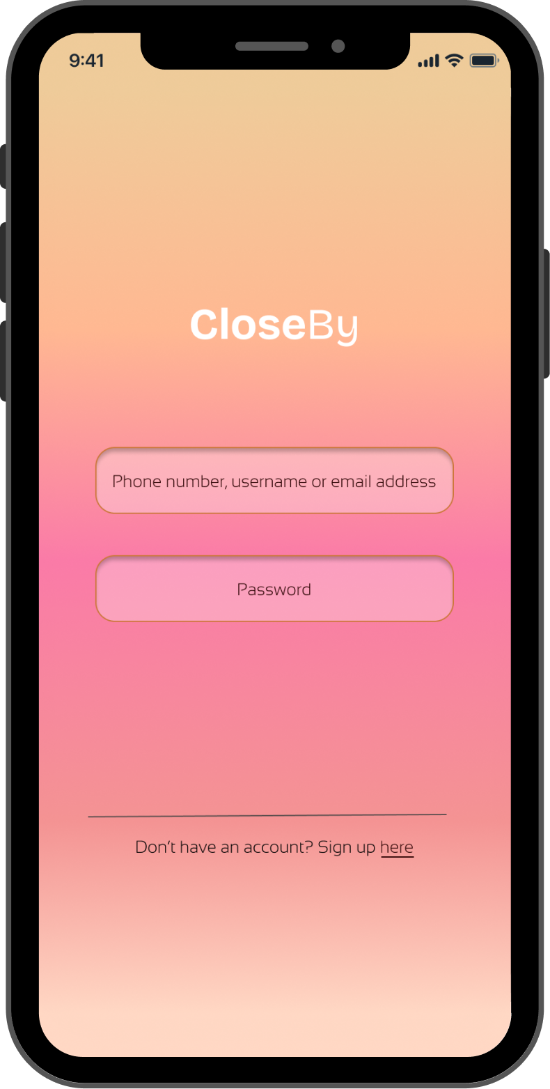
CloseBy
CloseBy is a local dating app designed to help people meet naturally through shared interests and nearby experiences.
01. Project Overview
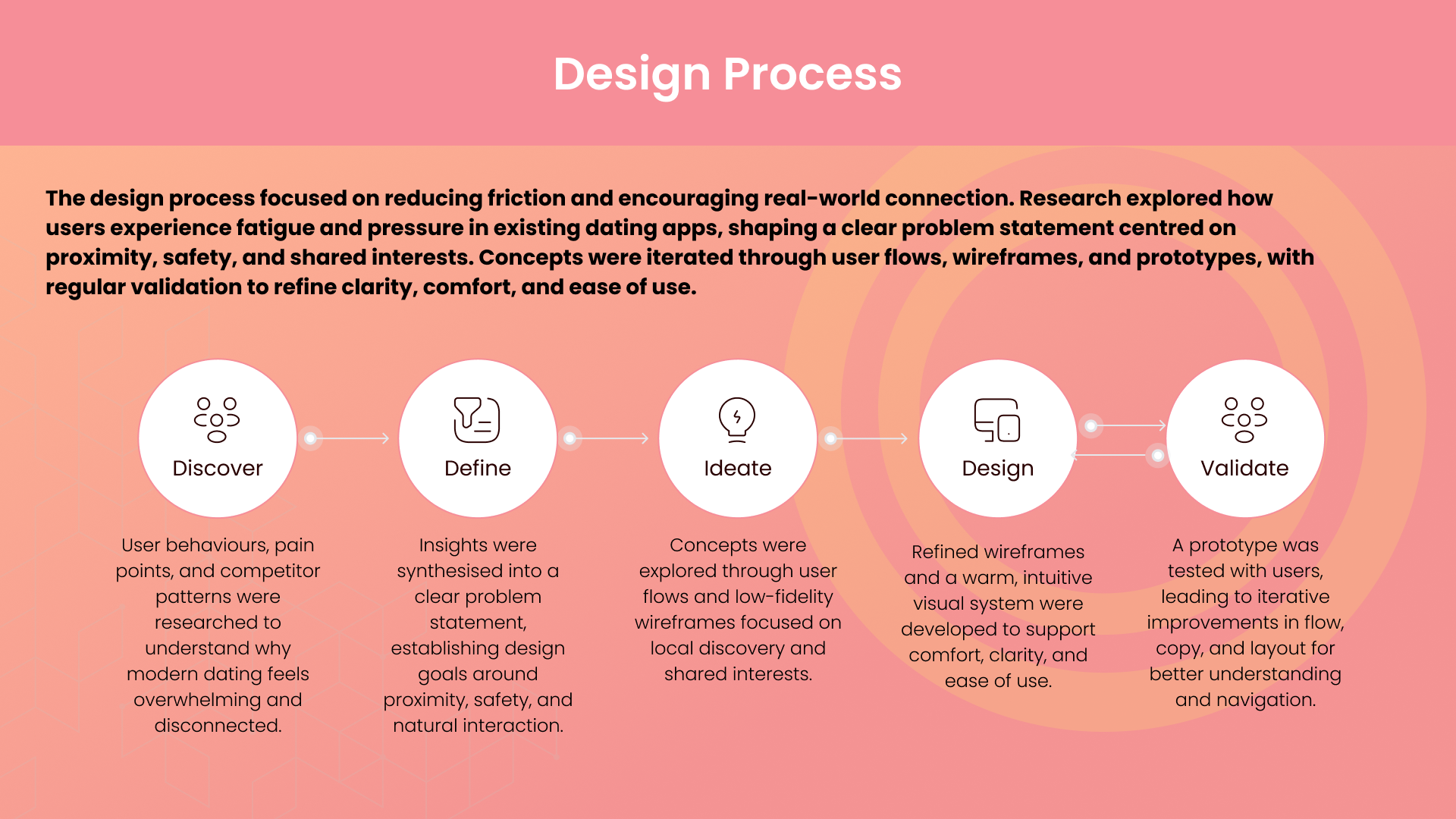
CloseBy reimagines dating around proximity, shared interests, and real-life experiences. Through a warm design system and a user journey centered on safety and comfort, the app helps people find meaningful connections close to home. This case study covers the research, UX strategy, workflows, and interface design behind creating a dating experience that feels more human and less overwhelming.
Role:
End to end design of app
Solo project
Team:
Tools:
Figma, Procreate
02. The Problem and Goal
Problem:
Modern dating apps prioritise swiping over meaningful connection. Users are often matched with people who live too far away, share few interests, and rarely progress beyond surface-level conversations. This leads to fatigue, low trust, and difficulty forming genuine, comfortable real-life connections.
Goal:
To design a dating experience that helps people meet locally, through shared interests, and in ways that feel natural, safe, and low-pressure. The aim is to support real human connection by focusing on proximity, community events, and a warm, intuitive user journey.


03.Core challenges and Soloutions
Encouraging Safe, Authentic Offline Engagement
Challenge
Users are cautious about meeting new people or visiting places without a shared signal of safety or social context.
Solution
Designed safeguards and social layers (such as trust markers and local event integrations) that encourage users to interact in contextually meaningful ways — e.g., community meetups instead of cold introductions — improving comfort and lowering social risk.
Balance Between Simplicity and Feature Richness
Challenge
Discovery tools often become cluttered with too many options, which can overwhelm and reduce usability on mobile.
Solution
Streamlined the dashboard and interaction hierarchy so core actions (search, filter, explore, connect) remain clearly accessible, with secondary options tucked into intuitive overflow controls to avoid cognitive overload.
Motivating Real-World Action
Challenge
Without meaningful incentives, users might browse passively rather than act — limiting real-world connections and event participation.
Solution
Integrated an event-driven reward system that acknowledges user participation in places and meetups, shifting the focus from passive scrolling to active engagement.
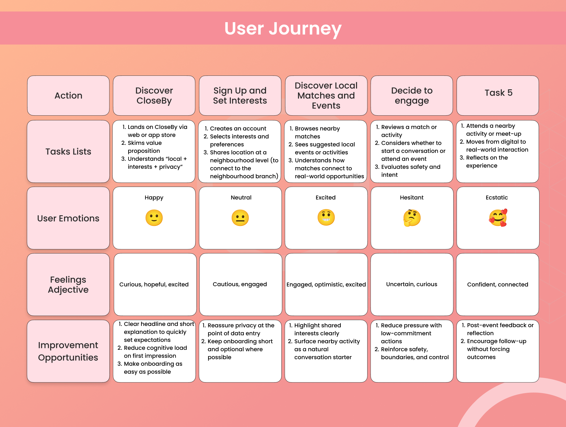
04. Process
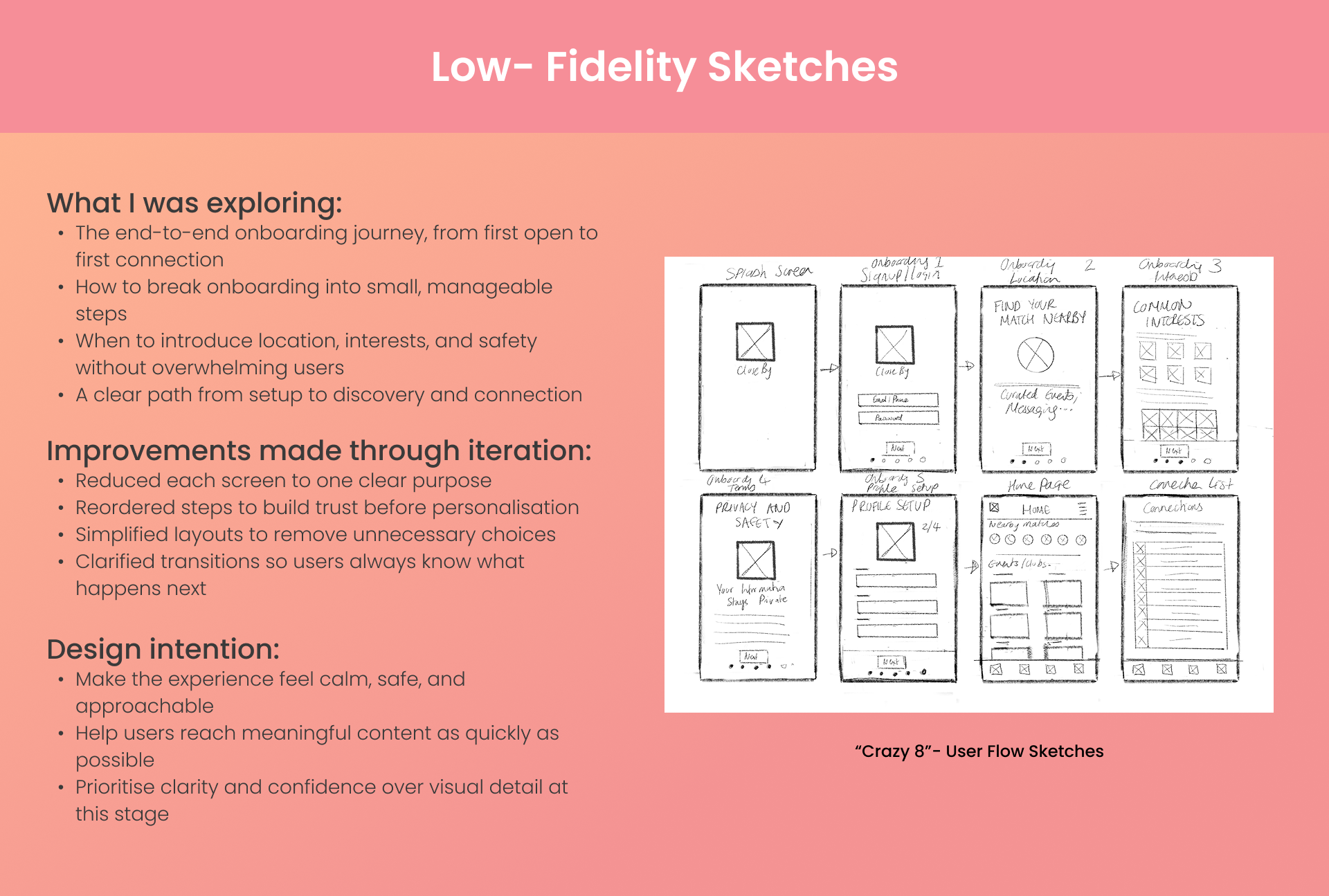
Information architecture
Wireframing and iteration
Safeguarding intergration
Visual system and UI refinement


05. Impact
Core product flows.
Web and app.

06. Learnings
Context is more powerful than proximity. Being nearby isn’t enough — users need shared intent or shared activity to feel comfortable engaging.
Micro-signals reduce social friction. Small interface cues (intent indicators, presence states) meaningfully impact confidence in initiating interaction.
Discovery must balance density and clarity. Too many visible options overwhelm; too few limit engagement. The map required careful hierarchy tuning.
Designing for spontaneity still requires structure. Even casual social interaction benefits from guided pathways and subtle prompts.
Safety perception shapes engagement. Users interact more freely when the environment visually communicates control and privacy.