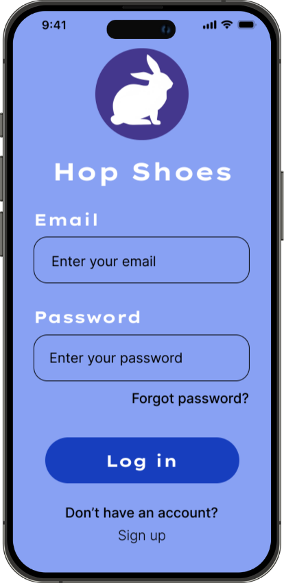
Hop Shoes
A friendly, intuitive mobile shopping experience for sports & lifestyle footwear.
Project Overview
Hop Shoes is a mobile shopping app designed to help young adults browse, compare, and purchase sports and lifestyle footwear with ease. The goal was to create a simple and friendly experience with a clean visual language, clear navigation, and an efficient checkout process.
The brand identity is approachable and energetic, centred around a playful “hop” concept that reflects movement, momentum, and individuality.
My Role:
End-to-end Product Designer (Research, user flows, wireframes, visual design, interaction design, prototyping, and design system).
The Problem
Sports shoe shopping apps often feel overwhelming, cluttered, or too brand-heavy. Users want to find shoes quickly, compare options easily, and check out without friction — but many existing apps bury core actions behind ads, pop-ups, or confusing navigation. Users reported frustrations such as:
Too many steps to find the right shoe
Inconsistent product information
Busy interfaces with visual noise
Complicated checkout flows
Hop Shoes aims to bring back clarity, friendliness, and simplicity.
The Goal:
Create a clean, intuitive shopping experience that helps users:
Browse sports and lifestyle shoes effortlessly
View product details clearly
Add items to cart with confidence
Complete checkout quickly
Enjoy an overall seamless, user-centred flow
The tone: friendly, modern, and easy to use.
Target Users:
Young adults (18–30) who shop for:
Running shoes
Gym trainers
Casual lifestyle footwear
Everyday sneakers
They value speed, clarity, aesthetics, and a smooth checkout experience.
Design Process
User Flow & Information Architecture
I began by mapping the end-to-end shopping journey to ensure the experience felt simple, predictable, and intuitive.
This included: onboarding, browsing, product details, cart review, delivery, payment, and confirmation.
Defining the flow early helped shape a clear structure for the interface.
Low-Fidelity Wireframes
Before moving into visuals, I created quick low-fidelity wireframes to experiment with layout, spacing, CTA placement, and information hierarchy.
This allowed me to refine the experience without getting distracted by colour or styling.
Visual Direction & Brand Exploration
I explored a clean, friendly visual language inspired by the “Hop Shoes” brand personality.
This involved defining a cohesive colour palette, choosing accessible typography, establishing spacing rules, and deciding on the level of playfulness to balance with professionalism.
Component Library
To ensure consistency, I built a reusable set of UI components including:
buttons, inputs, product cards, navigation elements, size selectors, and payment cards.
Establishing these early streamlined the high-fidelity design phase and kept the interface visually unified.

High-Fidelity Design
Once the system was in place, I produced polished screens focusing on clarity, accessibility, and ease of interaction.
Special attention was given to:
Product discovery and scannability
Clear visual hierarchy
Logical checkout steps
Mobile-friendly tap targets and spacing
Interactive Prototype
Finally, I created a clickable prototype to demonstrate the full user journey, validate usability, and communicate motion and interaction details.